The viz
In 2021 we saw the first Women’s US Open final between two unseeded players; Emma Raducanu and Leylah Fernandez. 18-year-old Raducanu took home her first Grand Slam championship when she defeated 19-year-old Fernandez in straight sets, 6-4, 6-3. Raducanu became the first qualifier to win a Grand Slam, also doing so in just the second Grand Slam tournament of her career 😳.
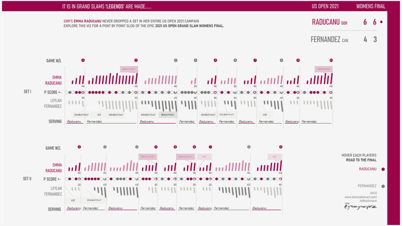
This viz celebrates how Raducanu became the first British woman to win a Grand Slam title since Virginia Wade won Wimbledon in 1977. Presenting each and every point, slog by slog. I wanted to try visualising the excitement and drama of how the match evolved (point by point) and relive how she achieved her straight sets win.
This win is made more special since Raducanu is also the youngest women’s tennis player to win a major since Maria Sharapova upset Serena Williams in the 2004 Wimbledon final 🥳.
What Inspired the Viz
If winning a Grand Slam tournament as a qualifier wasn’t impressive enough, Raducanu did so, dominantly, never having dropped a set en route to her victory. Raducanu is the first women’s player to win the US Open without losing a set since Serena Williams in 2014. Raducanu played 14 sets this tournament, and won every single one. If you include her three qualifying matches where she won six sets, that’s 20 straight set wins 🤯.
Key Techniques and Viz elements worth a shout out
This viz layers 4 key components (slightly clunky if I’m honest), a product of how the viz detail and design evolved as the viz build progressed, however sometimes it’s just not worth going back and optimising for a personal one off project!
- The top row dots. This design element highlights which player won each game. Tableau wise, nothing complicated here, just circles plotted on the ‘point by point’ axis, with calcs created to visualise and categorise the winner per game.
- The main bar lines depicting each players score at each point of each game. Tableau wise this is probably more complicated than it needed to be, but I wanted the lines to be angled 🙄 and therefore to achieve this it is not plotted as a bar chart but as a line chart (download viz for detailed reverse engineering). Obviously it would have been easier and less time consuming to have just had straight up and down lines 😂 but hey!
- The central dot section highlights who won each point. Tableau – utilising calcs to plot colour of each point dot and ascii character label to highlight the eventual winner per game.
- Bottom line shows player name and colour to pull out which player was serving for each game. Design wise this element was an after thought to allowing reviewing the viz prior to publishing I wanted to understand the relationship between point and game wins drawing attention to when a serve point was broken by the returning player.
- Tooltips are one of my favourite features of Tableau so don’t forget to check them out. Hover the headline scores top right and or the players name to see each player road to the final as well as contextual info and summary tables in the main viz.
Download the tableau workbook from Tableau public to see how these key features are leveraged to create this interactive visualisation.
Faff-Ometer
■■■■ / ■■■■■
Data Sources
Thanks for reading, ping me if you have any questions or thoughts about my viz.
