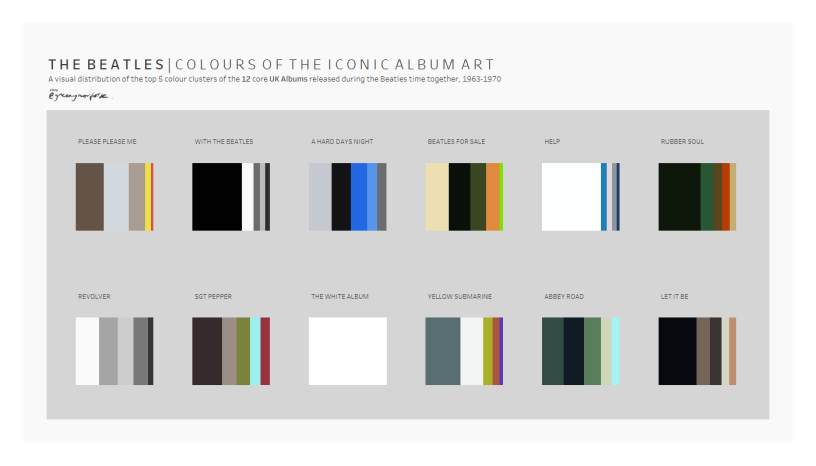
The viz
The visualisation presents the 12 UK album releases whilst the Beatles where together (1963-1970). Each artwork is presented by plotting the distribution of the top 5 colour clusters present in the album artwork as a bar chart, largest percentage to smallest, left to right.
About the album Art
The Beatles revolutionised album art, transforming it from mere sales tools to iconic works of art in their own right. From the half-lit heads of “With The Beatles” to the psychedelic nostalgia of “Sgt. Pepper’s Lonely Hearts Club Band,” and the simplicity of crossing Abbey Road. The Beatles did more than just leave their mark on the music scene, they helped change the face of album art too.
After creating the visual in Tableau, I felt compelled to understand the background behind each album cover to understand a little more why they are deemed so iconic now and so forward thinking at the time.
If you feel so obliged explore the art, colours and background behind each of the 12 album covers below – each cover art has a different and interesting story i have tried to capture in this post.
The text is pulled from many and various sources (Wikipedia, theBeatles.com, udiscovermusic.com among many others) , then summarised and condensed with a bit of ChatGPT then further refined and edited.
Please please me
Album release – March 1963
Cover – Angus McBean

In 1963, Angus McBean photographed The Beatles’ debut album cover for “Please Please Me”. Originally planned for a shoot at the London Zoo, the location was changed to EMI House in London’s Manchester Square. The cover art photo captures a fresh-faced four smiling down at McBean. Despite the apparent rush, it is documented that McBean deemed the shot fitting to the pace of the debut album, cementing its cover as music history legacy.
With the Beatles
Album release – November 1963
Cover – Robert Freeman

Inspired by Astrid Kirchherr‘s photos, Robert Freeman photographed The “With the Beatles” album cover. Like McBean this cover was not shot in a studio, but in the corridor of the Palace Court Hotel, Bournemouth, during their tour. The album art for “With The Beatles” reflects the early days of Beatlemania style, with a black-and-white portrait of the band in matching haircuts and polo-neck sweaters, exuding a sense of unity and youthfulness. The minimalist design allows the focus to remain on the band members themselves, capturing their charisma and flourishing fame. This iconic image set the tone for the band’s image and aesthetic, solidifying their status as cultural icons.
A hard day’s night
Album release – July 1964
Cover – Robert Freeman

For their 1964 album cover The Beatles are depicted in black and white portraits taken by Robert Freeman, all in matching distinctive polo necks and haircuts. Unlike their previous album, this time they played up to the camera, pulling various faces. The 20 portraits, including a shot of the back of George’s head, were taken in Freeman’s London studio.
The sleeve design, resembles reels of film, paying homage to a scene from the accompanying film where the band members face a barrage of journalists’ questions and photographers’ flashes. The visual said to mirror the spirit of music and era in which it was created.
Beatles for sale
Album release – December 1964
Cover – Robert Freeman

The Beatles’ album cover for “Beatles For Sale,” photographed by Robert Freeman in Hyde Park, London, portrays a tired-looking rock ‘n’ roll band, dressed almost identically and devoid of smiles. The simplicity of the design allows the focus to remain on the band members themselves, conveying a sense of authenticity and emotional depth.
Help
Album release – August 1965
Cover – Robert Freeman

The album cover for The Beatles’ 1965 release “Help!” was designed to complement their second film, featuring the band in snowsuit outfits from the movie and seemingly sending a distress signal in a semaphore. By 1965, Freeman had become The Beatles’ official photographer, shooting five of their album covers and numerous iconic photo sessions during the Beatlemania era.
The album art for “Help!” reflects the playful and adventurous spirit of The Beatles during a period of immense creativity and success. This whimsical cover art captures the band’s sense of humor and camaraderie, while also hinting at the lighthearted themes explored in the accompanying film. The use of semaphore flags adds an element of visual interest and intrigue, inviting viewers to decipher the message encoded in the cover art.
Rubber soul
Album release – December 1965
Cover – Robert Freeman

The cover art, devoid of the band’s name, depicted their distorted faces beneath the album title. Photographer Robert Freeman’s stretched effect on the photographs was accidental, occurring when projected onto an album-sized piece of card. The typography foreshadowed psychedelic poster art trends, showcasing The Beatles’ influence on visual aesthetics ahead of its time. The use of shadows and elongation adds a sense of depth and mystery to the image, inviting listeners to explore the complexities of the album’s music and theme.
Revolver
Album release – August 1966
Cover – Klaus Voormann

Inspired by illustrator Aubrey Beardsley artist and musician Voormann’s cover features a striking black-and-white collage of line drawings and cut-up photographs of the band members and other iconic figures. This avant-garde and surreal composition mirrors the eclectic and groundbreaking nature of the album’s music, which incorporates elements of psychedelia, Indian music, and avant-garde experimentation. Voormann’s artwork captures the spirit of the psychedelic era and has become an iconic symbol of The Beatles’ artistic vision during this transformative period in their career.
Sgt. Peppers lonely heart club band
Album release – June 1967
Cover – Peter Blake and Jann Haworth

In 1967, The Beatles ushered in a nostalgic yet revolutionary era in album art with “Sgt. Pepper’s Lonely Hearts Club Band.” Featuring over 60 life-size photographs representing friends, heroes, and icons, alongside waxworks of the band themselves, the cover aimed to be a timeless masterpiece. Artists Peter Blake and Jann Haworth were tasked with bringing this vision to life, elevating album packaging to the realm of art, specifically pop art.
The elaborate composition and vivid imagery encapsulate the spirit of the psychedelic era and the album’s eclectic mix of musical styles and themes. The cover also features a multitude of hidden details and references, inviting listeners to explore its detail and discover new elements with each viewing. I have to admit I see something new in it everytime I look.
The White Album
Album release – November 1968
Cover – Richard Hamilton

The Beatles’ iconic White Album, released in 1968, stood in stark contrast to its predecessor, Sgt. Pepper’s Lonely Hearts Club Band, with its minimalist white cover. Renowned pop artist Richard Hamilton was enlisted to fulfill Paul McCartney’s request for a design that diverged sharply from Sgt. Pepper’s vibrant aesthetic.
Designed by artist Richard Hamilton, the cover features a simple, stark white background with the band’s name embossed in small text. This departure from the colorful and elaborate artwork of their previous albums reflects the band’s desire to strip away distractions and focus solely on the music itself. The blank canvas serves as a metaphor for the album’s eclectic and experimental nature, inviting listeners to interpret its contents in their own way. Additionally, the lack of imagery allows the album to stand out amidst a sea of colorful and elaborate album covers, cementing its status as a timeless classic.
Yellow submarine
Album release – January 1969
Cover – Heinz Edelmann

The album’s psychedelic artwork, created by illustrator Heinz Edelmann, reflects the whimsical and psychedelic world of The Beatles’ animated film of the same name. Designed by German artist Heinz Edelmann, the cover features vibrant and colorful illustrations inspired by the film’s surreal and imaginative visuals. The artwork depicts various characters and scenes from the movie, including the iconic yellow submarine itself, surrounded by a kaleidoscope of psychedelic patterns and imagery. The playful and fantastical composition captures the spirit of adventure and creativity that defines both the film and The Beatles’ music during the psychedelic era.
Abbey road
Album release – September 1969
Cover – Iain Macmillan
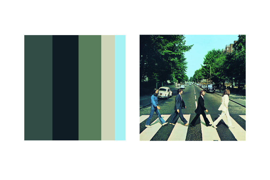
The album art for “Abbey Road” is one of the most iconic and recognisable in music history, featuring a photograph of The Beatles walking across a zebra crossing outside Abbey Road Studios in London. Shot by photographer Iain Macmillan, the cover captures the band walking in unison, creating a sense of unity and purpose. The simplicity of the composition, with the band members dressed casually and walking barefoot, contrasts with the elaborate and colorful artwork of their previous albums, reflecting a return to basics for the band. The photograph has since become a symbol of The Beatles’ legacy and has been imitated and referenced countless times by fans and artists around the world.
Let it be
Album release – May 1970
Cover – John Kosh (design) , Ethan A. Russell (photos)
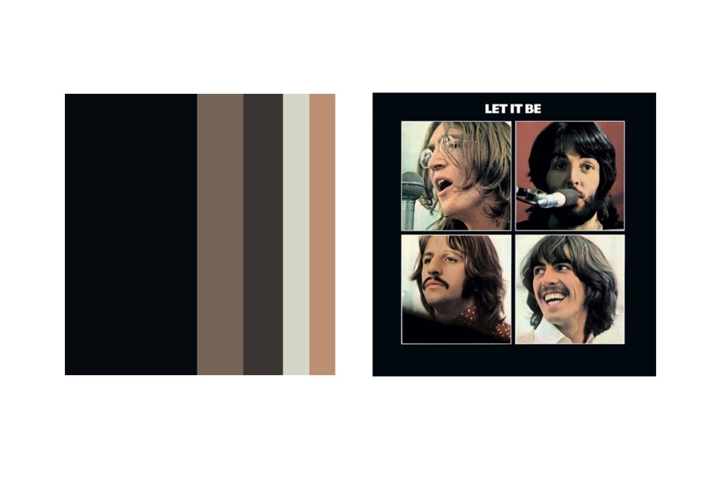
By the time “Let It Be” was released in 1970, The Beatles had already solidified their place in history and had split. John Kosh, who was responsible for designing the package, assembled four independent pictures against a black background. The photos were taken by Ethan A. Russell, during the film recordings in January 1969. In the U.K. and several other countries throughout the world, the final official Beatles album was first issued as a box set. The box set included a 164-page book with lots of text and hundreds of colour photos. The book was placed in a custom die-cut and recessed cardboard holder which held the LP on top. All of which was encased in an outer slipsleeve.
Key Techniques worth a shout out
For this viz I leveraged the image summarizer tool. A project and tool by Martin Krzywinski
- Image Summarizer
- Added all top 5 colour clusters and associated HEX codes to a spreadsheet along with some core album information
- Loaded the data into Tableau and painstakingly set each of the colours in default colours😤
Another viz I created using the same technique
Colours of the Red hot Chili Peppers
Download the tableau workbook from Tableau public to see how these key features are leveraged to create this interactive visualisation.
Faff-Ometer
■■ / ■■■■■
Whilst a bit slow to create the dataset (you could speed it up with the summarizer API), but the main tedious part was the assigning of HEX codes – please do shout if anyone knows of a way to speed this part up!
Thanks for reading, ping me if you have any questions or thoughts about my viz.
Adam
Powered by 🖤 with a little help from ChatGPT
