This is part of a series of posts focusing on some of the design thinking that can be applied to dataviz, pulling out a few deliberate design components in my own visualisations as examples.
I strive to engage a viewer in my visualisations and will share some of the small design choices I have made in the pursuit of choosing the right chart to help tell a better data story. In this post the focus is chart choice and the use of isotype charts.
What are isotype charts
An isotype chart, short for "international system of typographic picture education," is a visual representation of data using standardised symbols or icons. Each symbol represents a specific quantity, creating a pictorial language for easy understanding. Isotype charts simplify complex information and are effective for conveying data quickly and universally.
Some positives and pitfalls
Developed in the 1920s by Otto Neurath, the Isotype chart seems an alluring approach to engaging our audience and communicating our data, but like all charts they may not be for every occasion, dataset or insight you are trying to share.
Pros:
- Visual Engagement: Isotype charts capture attention and engage viewers through the use of pictograms, making data more accessible and memorable.
- Simplicity: They simplify complex data sets into intuitive visual representations, making it easier for audiences to grasp key insights at a glance.
- Versatility: Isotype charts can represent both quantitative and qualitative data, making them suitable for a wide range of applications across various fields.
Cons:
- Limited Detail: Isotype charts may lack the level of detail provided by other types of charts, which can be a drawback when conveying complex data sets.
- Potential for Misinterpretation: Without careful design and labeling, there is a risk of misinterpretation or confusion among viewers.
- Scale Limitations: Isotype charts may struggle to effectively represent very large or very small data values, limiting their applicability in certain scenarios.
TL;DR
Isotype charts are a visually engaging way to simplify complex data using pictograms. They’re versatile and intuitive, but may lack detail and could be misinterpreted without clear design and labeling.
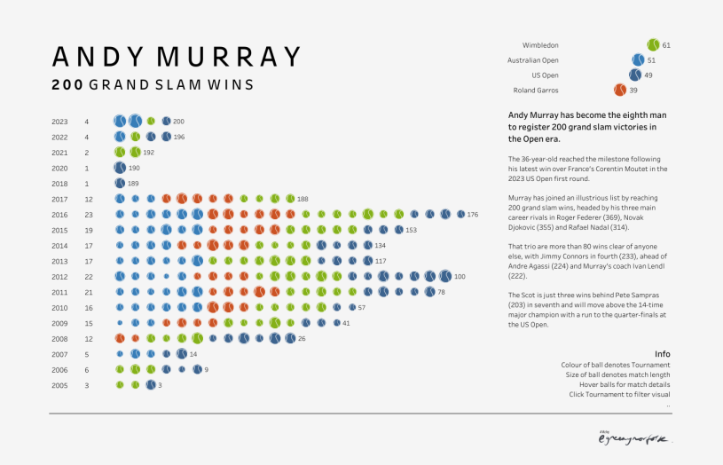
The pinch of design today focuses on my 2023 viz celebrating Andy Murray reaching 200 Grand Slam singles wins at the 2023 US Open Championships.
See this LTA article celebrating this amazing achievement

For this particular viz I wanted to avoid clutter and tennis imagery, but give the visual the best chance of catching a few likes on Twitter and views on Tableau Public. By leveraging a 🎾 as a visual to represent a single Grand slam win we lift the chart from bland to being a little more memorable and visually engaging, yet simple to understand. I have taken a little caution by providing a key to the visual to clarify the meaning behind the differing size of the tennis ball (which denotes the length of the match) to avoid any potential for misinterpretation.
Further info
If you are looking for a ‘how to in Tableau’, you would be hard pressed to find a better blog than Luke Stanke’s – Isotype Plots in Tableau
Or if you are after some deeper reading on all things Isotype, then Jason Forrest Nightingale articles (part 1 and 2) – Exploring Isotype Charts
Thanks for reading, ping me if you have any questions or thoughts about my viz.
Adam
Powered by 🖤 with a little help from ChatGPT
